Marketers in this day and age tend to incorporate the best marketing practices to make sure that their customers get exactly what they are looking for. Customers are king right now, and there is no denying the fact that pleasing a customer requires a lot of attention to detail and flawlessness.
Your contact form is an important touchpoint with your customer, which is why we have mentioned basic tips for you to incorporate within your contact form.

Informative
While the contact form for your website should look self-explanatory through its design, it is necessary that you make it informative to make sure that your visitors know this is a contact form. The worst design error that can be made in such a form is to not include an informative description that talks about the perks of this contact form and what the visitors can get from the contract or the subscription. The information should be compelling and should play an important part in pulling people over to your organization and building a good future relationship.
No Long Forms
All of us may have gone through a contact form of some nature through our life on the digital sphere. In fact, we get to see these contacts forms so many times during a day or a week that we have become accustomed to them. Such is the level of connection that we have with these forms that all of us have a compelling design in our mind that we know should be pertinent for a contact form. One thing that is almost always part of this imaginary design is that the contact form should always be kept short. A contact form looks good when it is short, and extending it a bit too much can lead to numerous repercussions. Having your client bail out halfway in between filling the form, because it is too long, is the last thing that you want to happen. So, try to keep the content within the form short, and make sure that whoever sees it gets in touch with you.
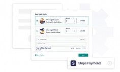
Have Definitive Action Button
There is a certain role that an action button plays in your online contact form, and it is best that you reap the best rewards from that role, by keeping it as definitive as possible. An action button that defines itself is best for your business, and will help attract clients. Instead of using confusing terms like OK, Done, Continue, try using terms that tell the customer what will happen after the form has been filled. If the form is for them to get a monthly newsletter, then the action button should have, ‘get monthly newsletter’ written on it.
Help Visitors in Filling the Form
Give proper examples of the answers that will go in each empty space, so that your visitors know how to fill the form. Visitors will feel more at ease with filling the form, if they get the desired level of help during the process. No one wants to fill a form without any directions.
Making a form isn’t really a walk in the park, but there are numerous online tools that help you in making contact forms. You can always head over to them for putting your design on paper.